Case Study: Standing Out in a Sea of Blue and White
How a mid-size CRO made a bold impression in a conservative industry
Client Background
A mid-sized clinical research organization (CRO) aimed to differentiate itself at a major pharmaceutical trade conference. In an industry dominated by corporate giants with near-identical branding, this firm needed a visual and strategic edge.
The Challenge
The company needed to communicate its ability to manage highly complex clinical trials with agility, creativity, and speed — strengths not typically associated with larger firms.
- How do we convey both the rigor and the creativity involved?
- How can we visually break free from industry conventions?
Industry Insight
Most competitors rely on conservative branding: blue and white, sterile design, minimal energy. The result? A trade show floor where everything looks the same.
Our opportunity: break the mold with bold color, engaging storytelling, and clear differentiation.
Strategic Solution
We developed a dual-concept creative direction:
- Structure: A literal Clinical Trial Road Map demonstrating process expertise.
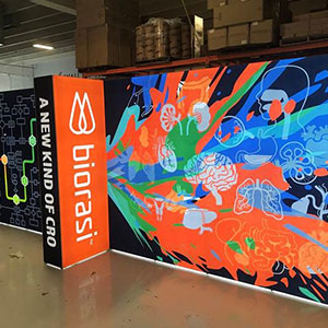
- Spontaneity: Vibrant, free-flowing visuals representing agile thinking and creativity.
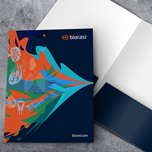
Bright colors, organic shapes, and layered layouts helped the company look — and feel — different. The new visual identity reflected not just their competence, but their energy.
Execution
- Designed booth and printed materials around the Clinical Road Map concept
- Integrated real-world problem-solving examples into interactive media
- Reimagined the brand’s color palette to reflect confidence and innovation
📈 Results
- 65% increase in booth traffic vs prior year
- 200+ marketing packets distributed in 2 days
- 12 high-value lead meetings booked, including major pharma firms
- Significant uplift in brand confidence internally and externally
Visual Highlights
“We finally looked like who we actually are — bold, innovative, and ready to take on challenges the big firms can’t.”
Conclusion
By leaning into their strengths and visually breaking from industry norms, the CRO made a lasting impression and repositioned itself as a bold, capable alternative to the legacy giants.


